Partnership Overview
MG Strategy + Design partners with McKinsey & Company to enhance its visual storytelling capabilities, particularly in the realm of data visualization and global publishing.
Recognizing the importance of clear and engaging visuals in conveying complex information, McKinsey sought MG’s expertise to support internal teams in producing high-quality visual content.
This collaboration aims to assist McKinsey’s researchers and authors in developing compelling visuals that align with the firm’s standards of excellence.
Data Visualization Expertise
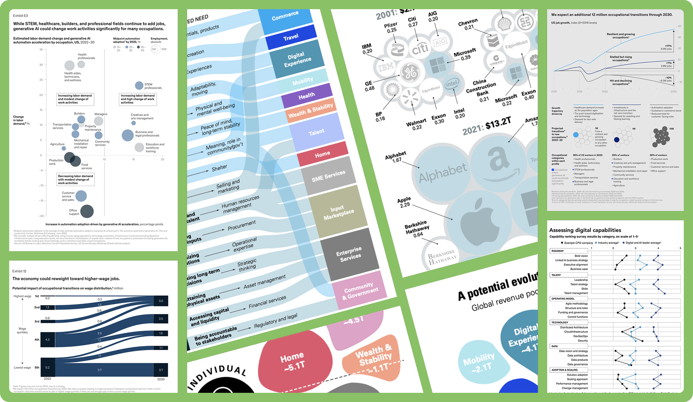
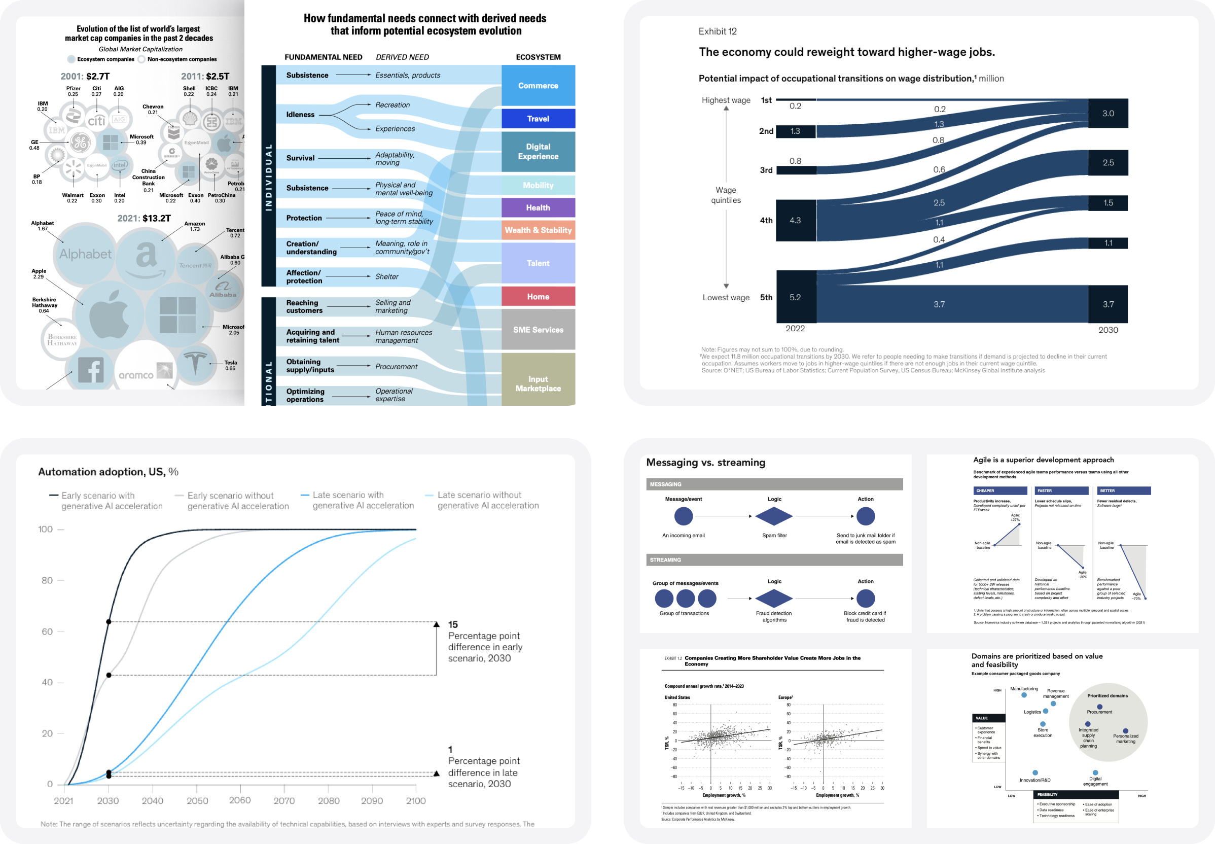
MG Strategy + Design contributes to McKinsey’s data visualization efforts by assisting with both large and small chart creations. Our role involves iterating visual ideas with report researchers, addressing questions with author teams, and providing support to ensure timely delivery of visual content.
This collaboration emphasizes the development of “small-space data viz ideas and solutions,” catering to formats like newsletters and reports where space is limited.
MG’s involvement ensures that McKinsey’s visual content remained imaginative and groundbreaking, effectively communicating insights to decision-makers.
Publishing
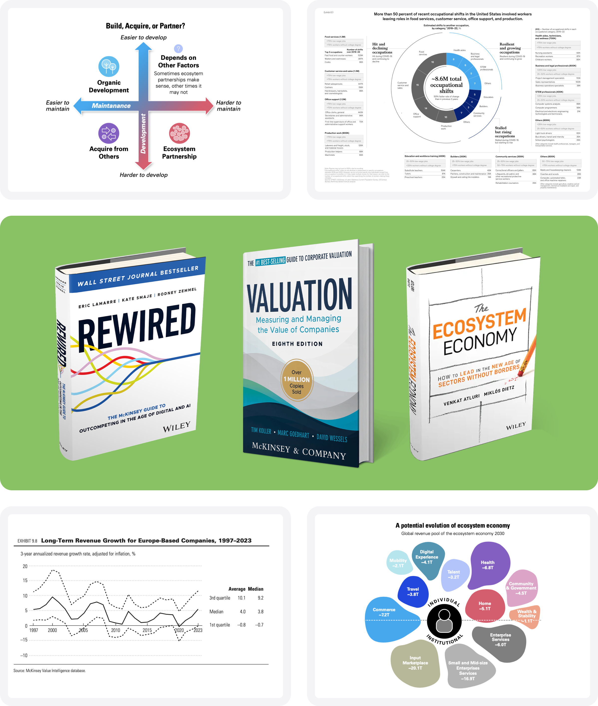
MG Strategy + Design has played a significant role in developing data visualizations for several books authored by McKinsey partners, including:
- “Rewired” by Eric Lamarre, Kate Smaje, and Rodney W. Zemmel
- “The Ecosystem Economy” by Venkat Atluri and Miklós Dietz
- The upcoming 8th edition of “Valuation: Measuring and Managing the Value of Companies” by Tim Koller, Marc Goedhart, and David Wessels
Creating visuals for these publications required MG to work under tight deadlines and engage in iterative cycles with author teams. We often had to invent workflows and processes that met both the authors’ needs and the publishers’ requirements. This work demands a deep understanding of McKinsey’s commitment to excellence in visual storytelling, particularly within the constraints of book formats.
Our Impact
Through this collaboration, MG Strategy + Design has supported McKinsey & Company’s mission to communicate complex information effectively through visual means. We’re proud to contribute to McKinsey’s insightful and accessible content for global leaders and decision-makers.
By assisting in data visualization and publishing efforts, MG helps McKinsey maintain its reputation for excellence in visual storytelling, ensuring that insights are not only informative but also engaging and impactful.
Services
Strategy
Data Visualization
Print & Graphic Design
Project Management